ShopDreamUp AI ArtDreamUp
Deviation Actions


Comments3
Join the community to add your comment. Already a deviant? Log In
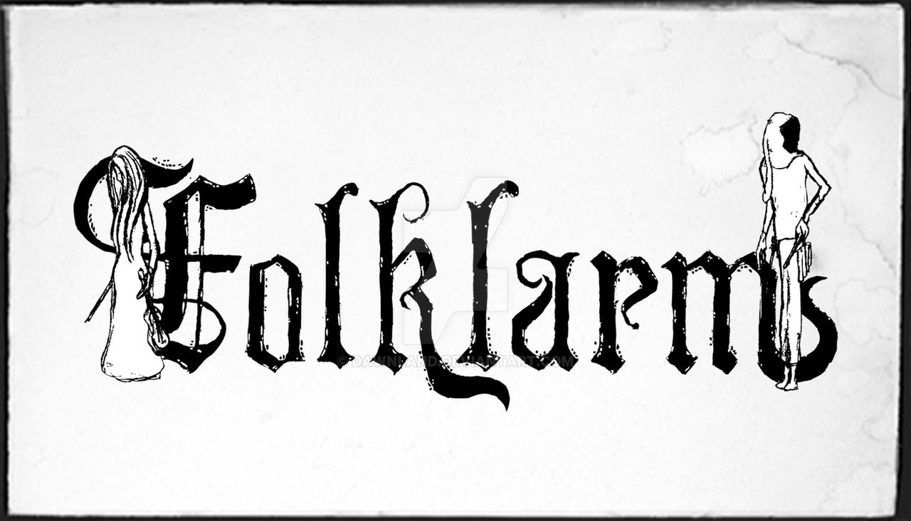
I can appreciate the illustrations but I have to say I speak from experience when I say a logo with illustrations can be troublesome when applying to album artwork. In that regard it's a good thing the illustrations are quite abstract. In general it's a beautiful logo though and the effect on the lettering is just awesome. I have a few remarks though:
- The top of the curl in /k is thinner than the thin strokes in the other letters. I would keep it consistent.
- The logotype seems to run a bit diagonally. It might just be an optical effect, but I would place a horizontal guideline on the bottom of the letters to make sure. If it's not aligned I would re-position the letters a bit.
- The F is not exactly vertical. I would rotate it counter-clockwise a bit.
- The illustration on the right is bigger than the left one. I would make it a bit smaller to maintain balance.